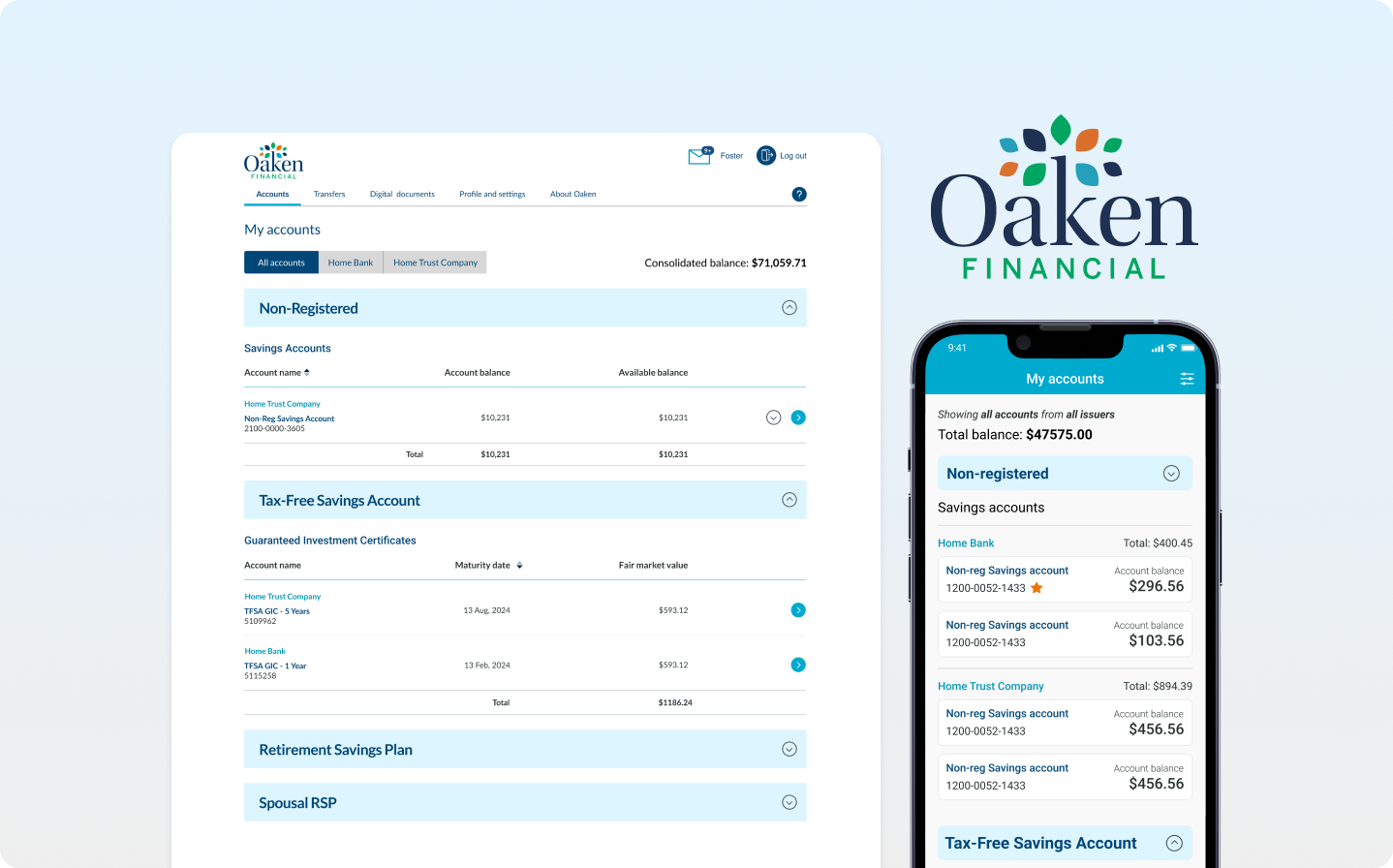
My experience redesigning the Oaken financial account summary page on mobile, web, IOS and Android devices.
Redesigning the Oaken Digital accounts summary page across all platforms—mobile, web, iOS, and Android—was a comprehensive endeavor that required an in-depth dive into user experience (UX) research.
We identified significant gaps in the information architecture of the account summary page through surveys conducted with existing Oaken customers and an analysis of the overwhelming number of calls to the contact center regarding difficulties in locating information on the account summary page. This research was then used to redesign and update the UI, ensuring we created an intuitive, seamless, and accessible design.
TIMELINE
August - December 2023
MY ROLE
Lead UX Designer
TEAM
1 UX Researcher | Business analyst | 4 Developers
DEVICES
Mobile responsive, Desktop, IOS & Android
Introduction
Let me start by giving you some back story..
Before the digital team came on board, Home Trust's banking services were limited to physical branches across Ontario. The launch of Oaken Digital and Home Digital in 2021 was a game-changer, marking Home Trust's first step into digital banking. Thanks to the team's efforts, these platforms saw a huge 80% boost in new customer sign-ups, giving Home Trust a major edge in the digital banking world.
Snapshot of the project
Project Overview
Oaken Digital, Oaken financial’s new and enhanced online banking platform and mobile app was launched in 2021. At the end of Q3 2022, the customer support team as well as our annual survey indicated that almost 15% of the users had some constructive feedback to give about the account summary page.
The goal of this project was to solve the issues that users were calling in about in regards to their account summary page and improve the overall user experience on all digital platforms.
What were the main problems?
High Cognitive Load: The design imposed a significant cognitive burden on users, requiring excessive mental effort to understand and use the page efficiently.
Navigational Complexity: Users struggled to access different sections of the accounts summary page, especially when managing multiple GICs.
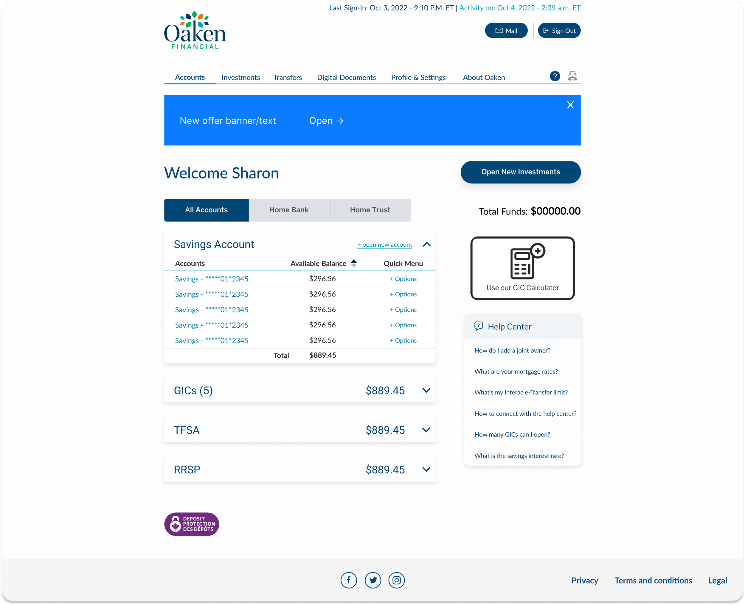
Inefficient Account Management: Users with multiple savings accounts such as GICs struggled to locate and manage their investments due to the page's layout and information architecture.
The final result
Adding feature enhancements to improve the cognitive load and navigation
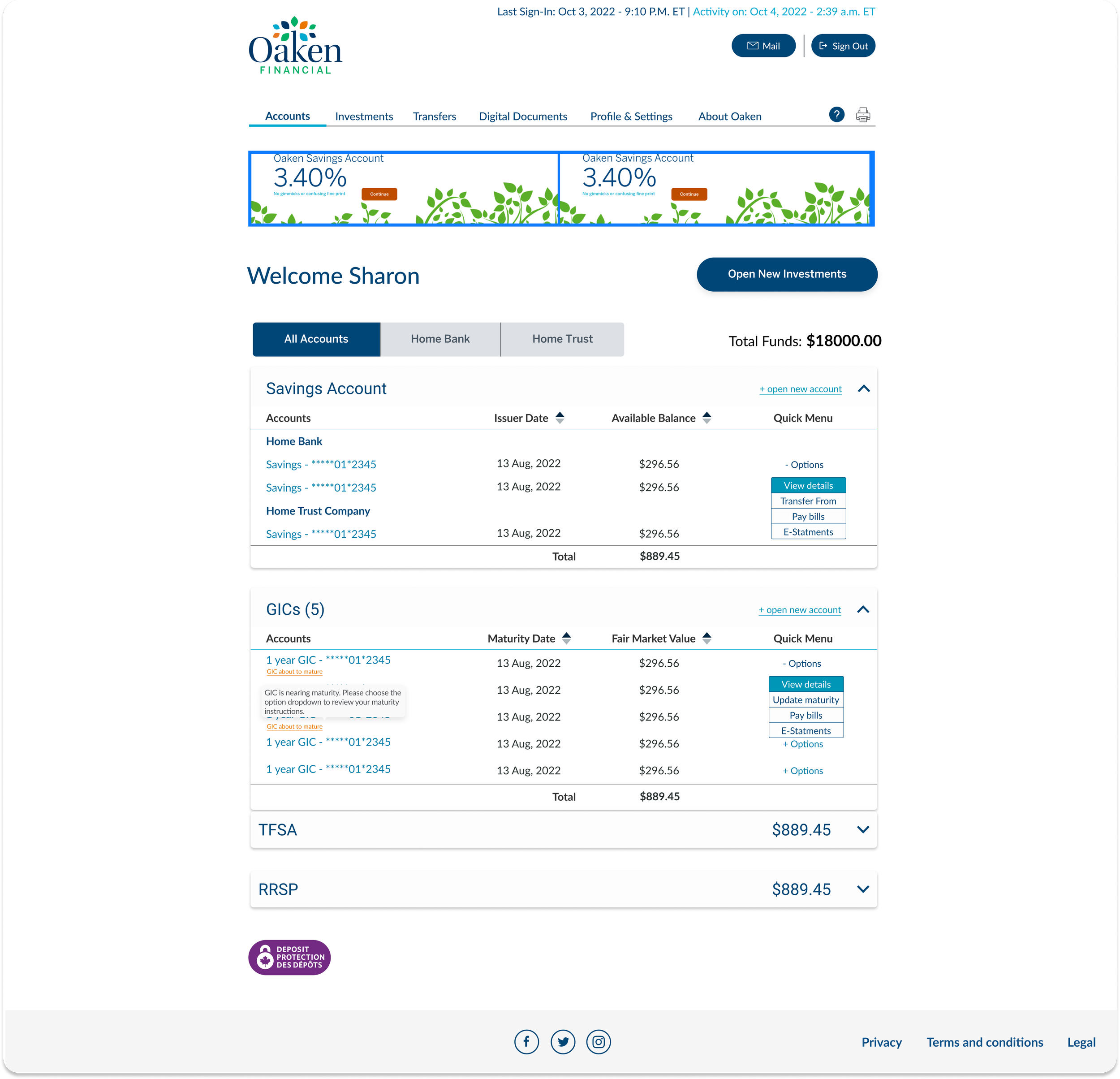
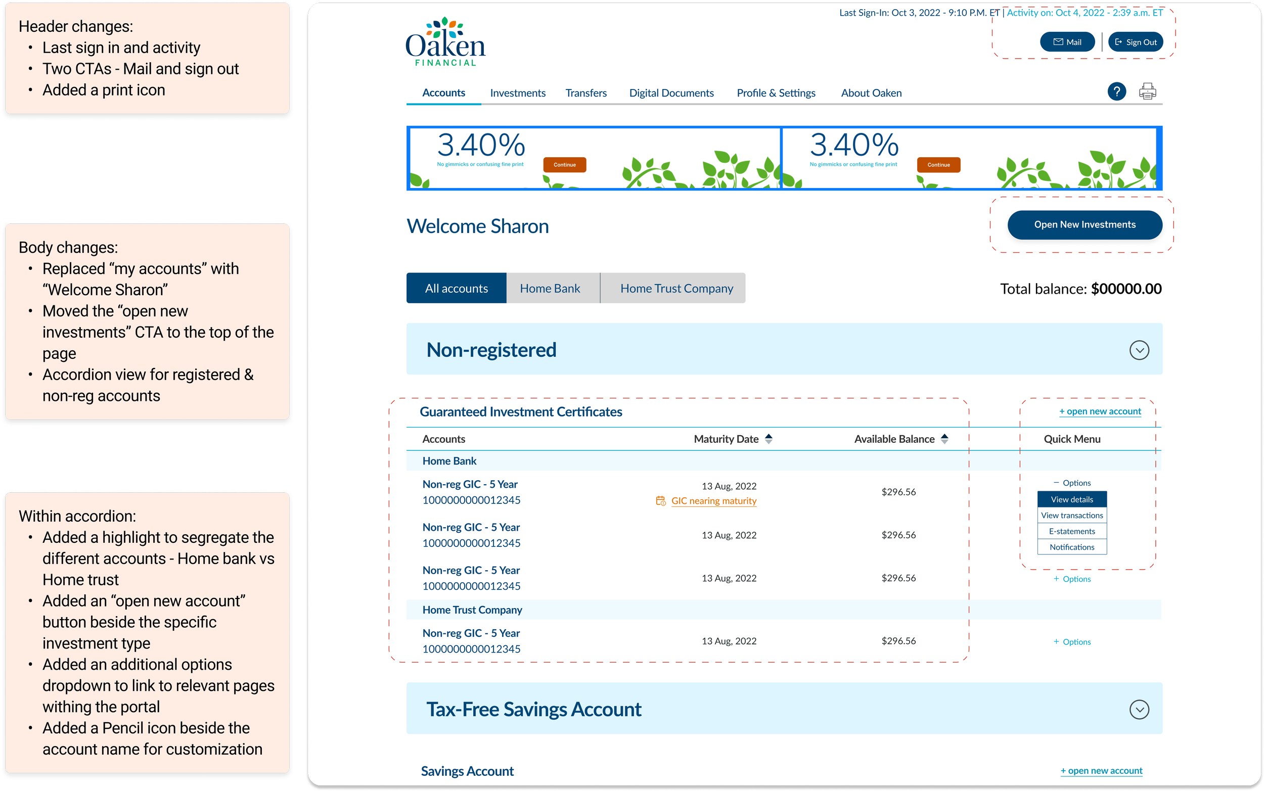
FEATURE 1: Adding Accordions
This approach allows the users to expand and collapse sections of the accounts summary page, making it easier to manage the visibility of information, particularly beneficial for users with multiple GICs.
Feature 2: Enhanced Visual Hierarchy
By making account names more prominent through the use of bold fonts, color contrasts, or distinctive icons, users can quickly and effortlessly locate their various accounts, including multiple GICs.
This visual strategy not only improves the readability and accessibility of the accounts summary page but also facilitates a more intuitive navigation experience, allowing users to efficiently manage and access their accounts.
What was the business impact?
Overwhelmed contact centre & hightened user frustration leading a to loss of customers
The contact centre experienced significant strain due to an influx of calls from users struggling to locate information on the account summary page. This situation diverted agents from addressing more critical inquiries as they frequently assisted users in navigating the interface, particularly to find maturing GICs.
The design of the page required users with multiple GICs to scroll extensively, often leading to inadvertent auto-renewals of GICs users intended to cash. This not only heightened user frustration but also substantially increased the workload on customer support, impacting overall service efficiency and customer satisfaction.
What did the research show?
To tackle navigational and information architecture challenges, we conducted a survey of over 200 active Oaken digital customers, gaining valuable insights that informed our enhancements.
Among the respondents, 22% expressed a desire for an improved interface, while 15% indicated they would appreciate easier navigation to account details on the summary page.
Users expressed frustration with the interface, finding it inefficient and time-consuming to scroll through to locate the information they needed.
Which competitors stood out?
From our survey of 200 respondents, we identified three main competitors that stood out:
Tangerine offers a user-friendly experience, ensuring ease of use for customers, while TD stands out for its intuitive design and easy navigation. EQ Bank complements these strengths with a visually balanced interface, providing a seamless and aesthetically pleasing experience.
Design explorations
We went through a extensive iterative design process before deciding on making the existing updates
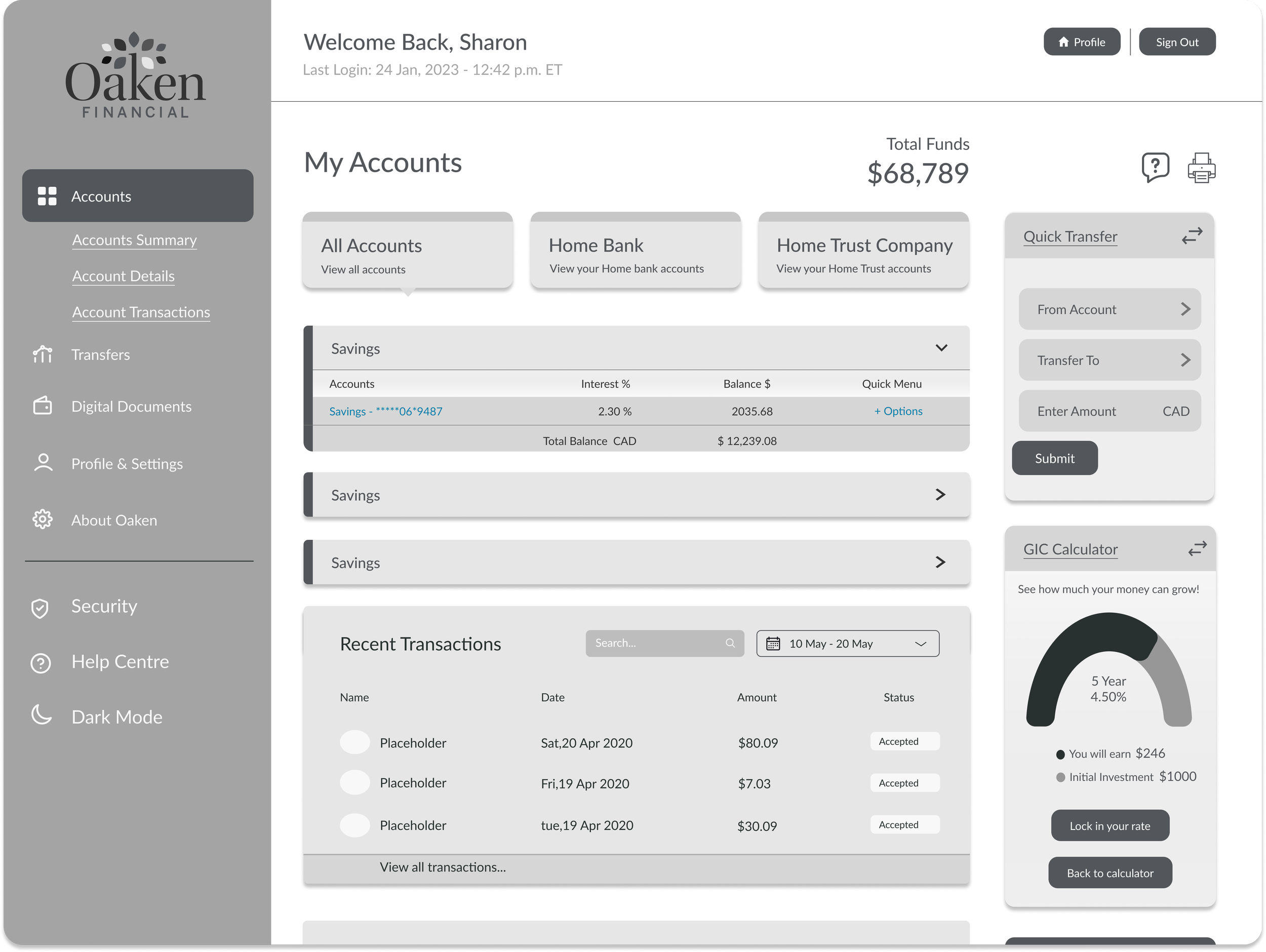
Version 1: Complete Revamp
Version 3: Updates to existing UI
Version 2: Layout updates
Version 4: Refined V3 to focus on priority UX changes
Designing the solution
We opted to redesign the account summary interface to be intuitive and consistent with other platforms our users are familiar with.
The design process began with extensive user research, we analyzed the surveys, and conducted usability testing to understand user needs, preferences, and challenges. This discovery phase was key to empathize with users and create a solution that answered all the pain points and delivered the best user experience for our users.
Defining the success metrics
With limited time and resources, we couldn't roll out a full redesign of the digital banking platform. Instead, we focused on selective UI enhancements to address the main issues and keep our users happy.
The results….
Following the launch of the redesigned account summary page, we conducted a follow-up survey to guage user sentiments. The results were: 80% of users expressed satisfaction with the new design, noting improved ease of navigation and better accessibility to their information.
Retrospective
So what did I learn..
Learn to pivot and adapt
Originally, we aimed for a major platform redesign, starting with whiteboarding sessions and testing early mockups with stakeholders and a small focus group. But as business goals changed, we shifted gears to focus on key UX improvements instead of a total overhaul. This process really taught me how to quickly adapt and not get too attached to my initial designs, ensuring we still delivered solid results.
Test on all devices repeatedly
During usability testing, the design team encountered challenges in accessing iOS and Android mobile testing devices, which delayed the launch and UAT process. To overcome these hurdles, we worked closely with the QA and development teams to address bugs and design discrepancies. This collaboration not only enhanced our cross-functional teamwork but also enabled us to resolve issues quickly and efficiently, improving the overall project flow.
For privacy reasons, I can only share an overview of the designs and not describe the full case study. Please reach out if you'd like to learn more about the project.


