My experience creating a Design System from scratch.
When I joined Home Trust Company as a UI Designer in winter 2022, the existing design system lacked depth, covering only high-level features with inconsistent components and interactions across platforms.
To address this, I crafted a development-friendly design system in Figma for our banking platforms, Oaken Financial and Home Digital.
TIMELINE
October 2022 - May 2023
MY ROLE
Lead UX Designer
TEAM
1 Project lead | 2 UX designers | 2 Developers
DEVICES
Mobile responsive, Desktop, IOS & Android
Introduction
Let me start by giving you some back story..
Before the digital team came on board, Home Trust's banking services were limited to physical branches across Ontario. The launch of Oaken Digital and Home Digital in 2021 was a game-changer, marking Home Trust's first step into digital banking. Thanks to the team's efforts, these platforms saw a huge 80% boost in new customer sign-ups, giving Home Trust a major edge in the digital banking world.
“Enter: Your’s truly 🙋🏻♀️... I was brought on to lead the design system build in-order to grow and streamline our digital banking initiatives”
Snapshot of the project
Project Overview
Inadequate design guidelines had caused persistent inconsistencies across the Oaken and Home Digital platforms, leading to a lackluster user interface and experience. Determined to tackle these issues, I set out to create a design system that would transform usability within the organization.
By employing the design thinking process, I developed a Figma-based design system tailored for smooth development and seamless integration. This involved harmonizing components with core design principles and incorporating feedback from developers. The result?
A dynamic design system that fosters efficient collaboration and delivers a cohesive, engaging user experience.
The final result
A comprehensive design system build for Oaken financial and Home digital
What was my impact?
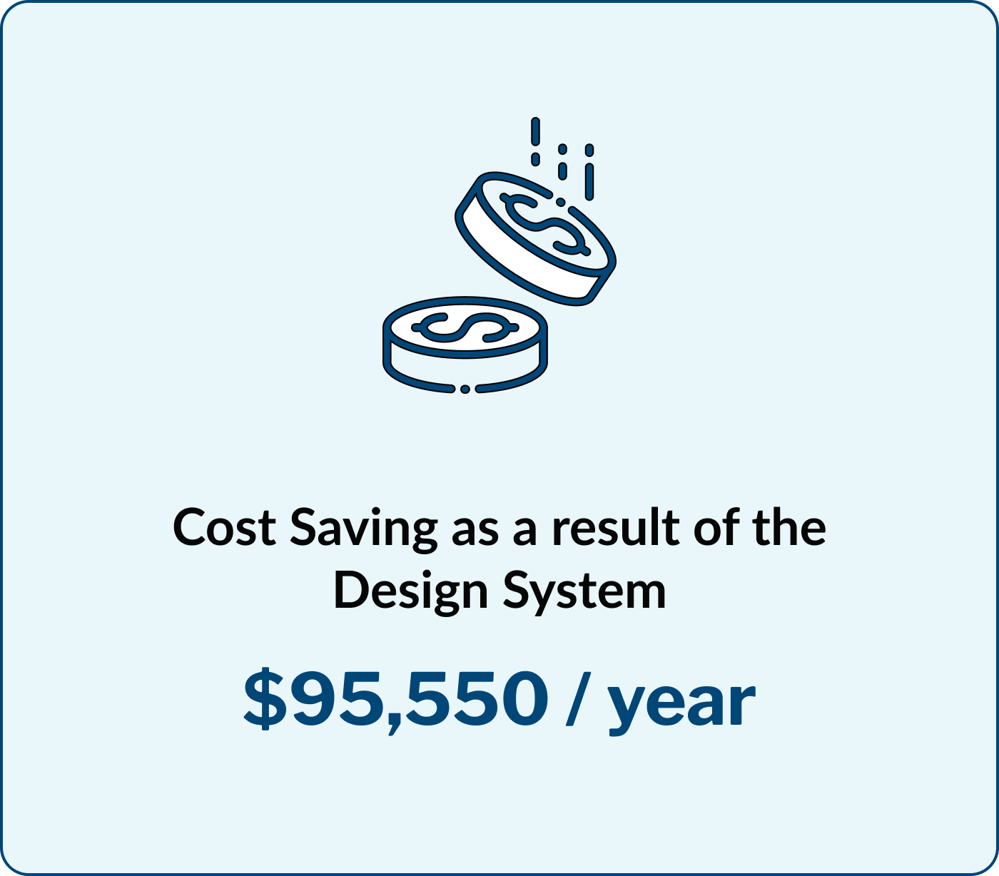
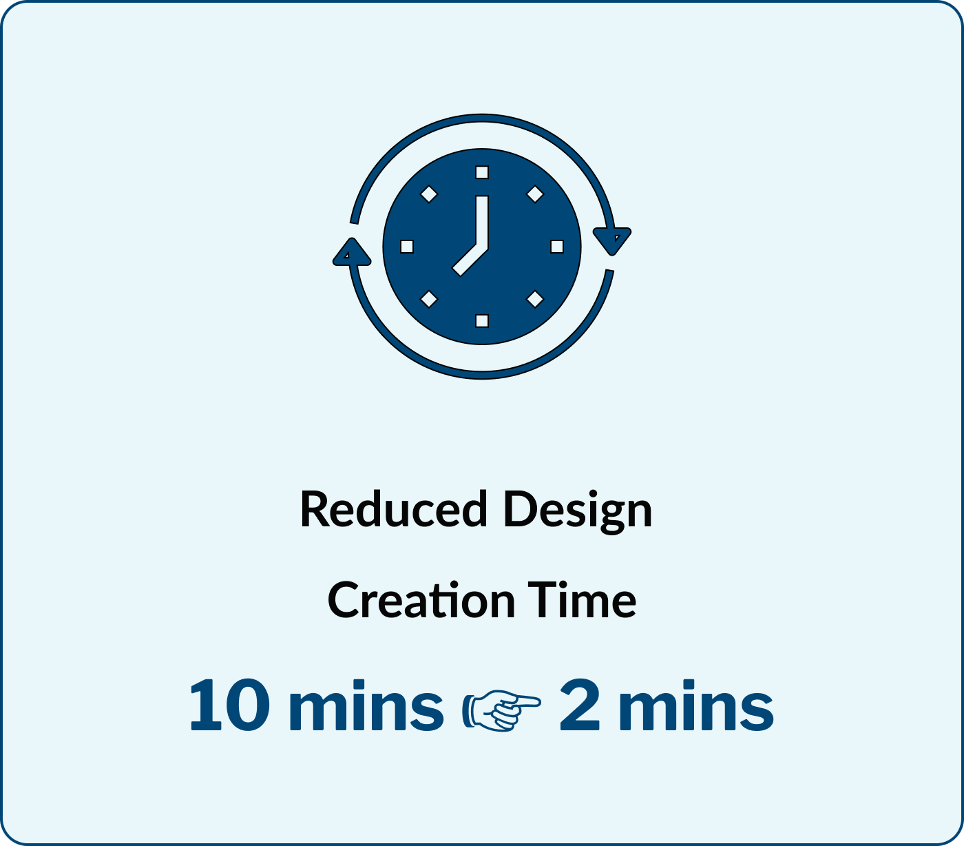
Reduced design time by 86% and significant business costs
As a product evolves, understanding its complexities and onboarding new team members becomes increasingly demanding. Without a well-structured design system in place, it takes more time and resources to bring features to market effectively.
With the Home design system in place, our development team can build new features within the sprint and at scale, allowing the team to focus on fine-tuning the features and innovating for our customers.
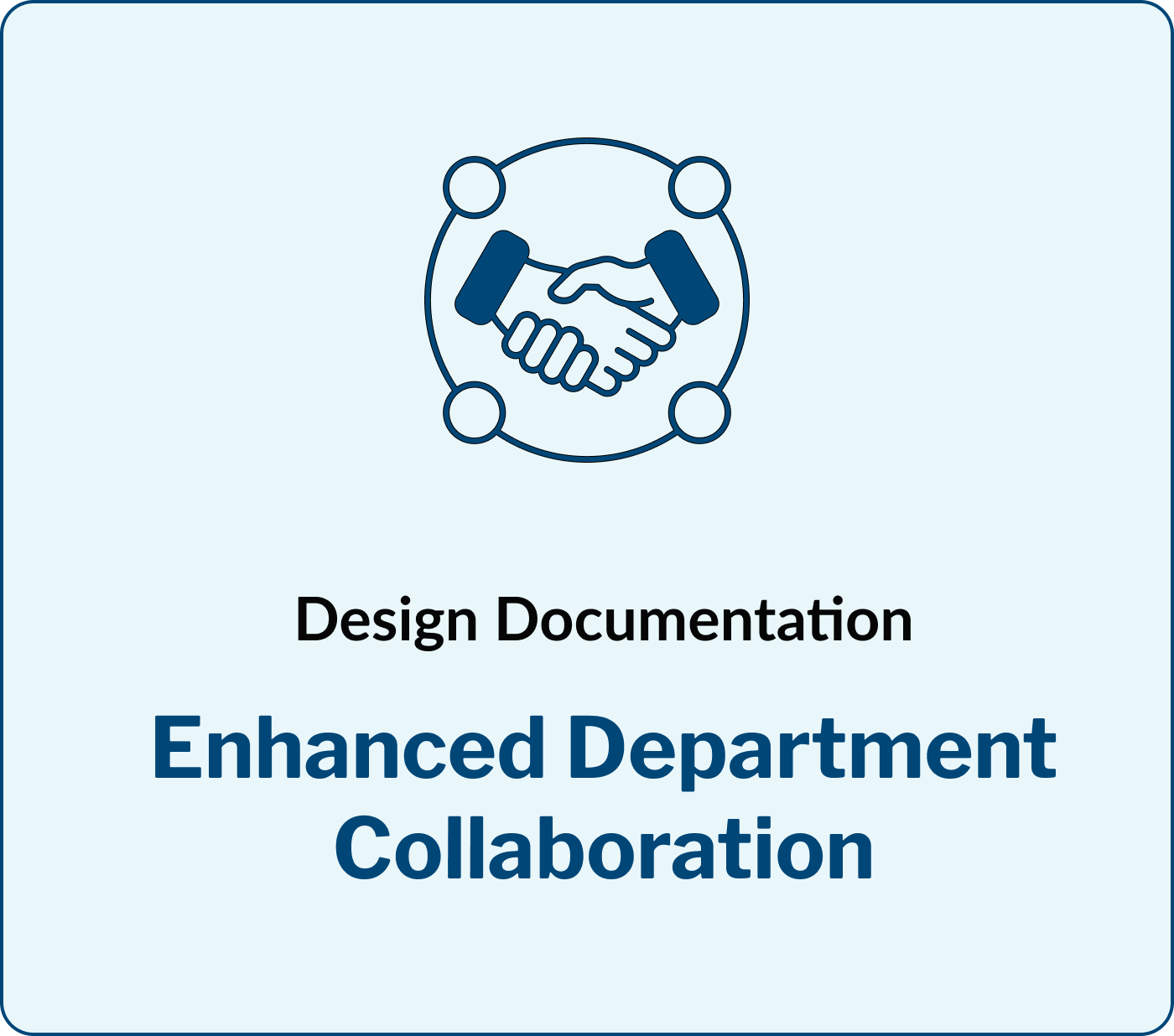
““The documentation is incredibly user-friendly, making the system straightforward to use and saving me a lot of time getting up to speed.” ”
Why did Home Trust need a design system?
Existing pain points & problem statement
Inconsistent User Experience: Without a standard UI library, Home Trust’s digital platforms had many design inconsistencies, confusing users and risking reduced engagement and trust in the brand.
Increased Development Time and Costs: Without clear guidelines and reusable components, developers faced longer development cycles, increased debugging efforts, and higher costs associated with fixing design-related issues.
Hindered Innovation and Scalability: Without a local design system, designers had to create assets from scratch, limiting innovation and design validation. This lack of a solid UI component foundation hindered the team's ability to scale design efforts across platforms.
How did I define the goals?
Defined the scope and created a roadmap
I took charge of defining the design scope to address our key challenges. By setting clear goals aligned with both user and business needs, I used these objectives to refine our guiding principles.
Here are the key goals I focused on:
It was important to adopt an iterative design and development process in order to handle the complexity of the components and focus on the MVP. So, I split the project into three parts: V1 for Q2 and V2 for Q4.
What did my design process look like?
Understanding existing design inconsistencies and conducting a UI audit
I kicked things off by compiling all our existing components and diving into the design bug repository on the Azure DevOps board. This hands-on approach helped me put together a detailed analysis of the existing platforms, setting the stage for further analysis and improvements.
I then dove into a detailed review of our current design elements.
STEP 1: Comprehensive examination of design elements.
This included analysing colour schemes, typography, layout structures, and interactive components.
STEP 2: Evaluation against design principles and usability standards.
Each aspect was meticulously scrutinised to identify inconsistencies, inefficiencies, and areas for improvement.
After evaluating design operations, I performed a Heuristic Evaluation of the platforms. This audit identified issues such as inconsistent visual styles, fragmented user flows, accessibility concerns, and scalability limitations.
These findings provided a solid foundation for targeted refinements to enhance user experience and ensure a cohesive, intuitive, and scalable design system.
Some of the comments captured on Azure:
What did the discovery phase include?
Explored the existing design operations and reviewed established design systems
I started the discovery phase by exploring different design systems and interfaces, taking inspiration from leading practices and fresh ideas. I especially drew insights from Atlassian and Google’s Material 3 design systems.
In my early days at Home Trust Company, I immersed myself in understanding the evolution of our designs and digital platforms, engaging with the team to learn about past efforts, current advancements, and our future goals.
My aim was to get a clear view of how design and development processes were structured and how we could enhance them moving forward, ensuring our design system could effectively support our objectives.
Now lets get into the design process
Started building out the design system focused on the north star principles
For this phase of the project, the design system is tailored specifically for mobile and web platforms to align with current scope and project demands.
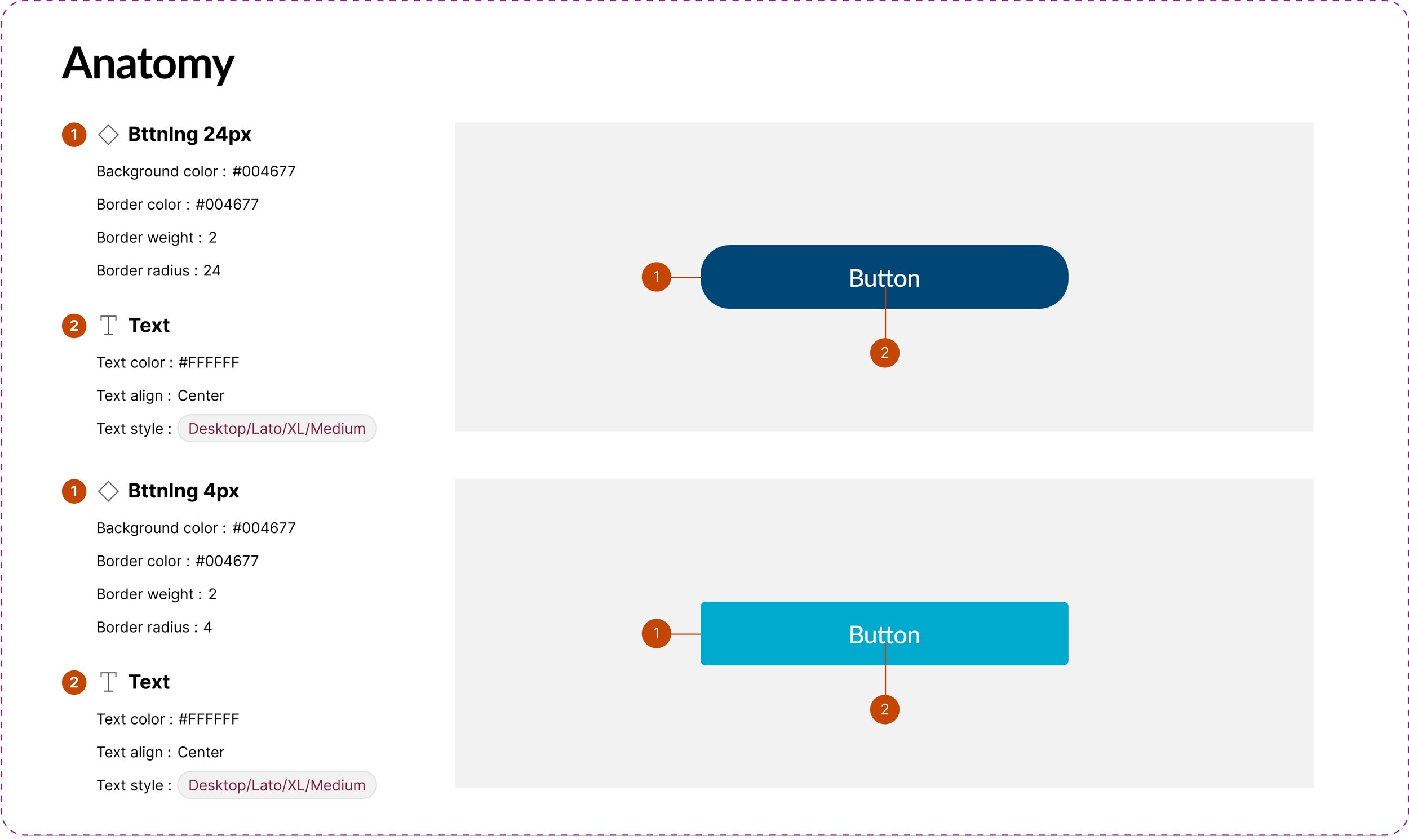
After consulting with the development and design teams, we adopted Tailwind CSS's default sizing values for consistency across viewports and components. I focused first on foundational elements like color palettes, fonts, and buttons, then progressed to more complex components like templates and pages.
Colour variables
Focused on simplicity: To streamline the design system, I consolidated component variations and focused on essentials. For instance, I optimized color schemes to five shades per hue and merged redundant variations based on relevance and proximity.
Interactive Components
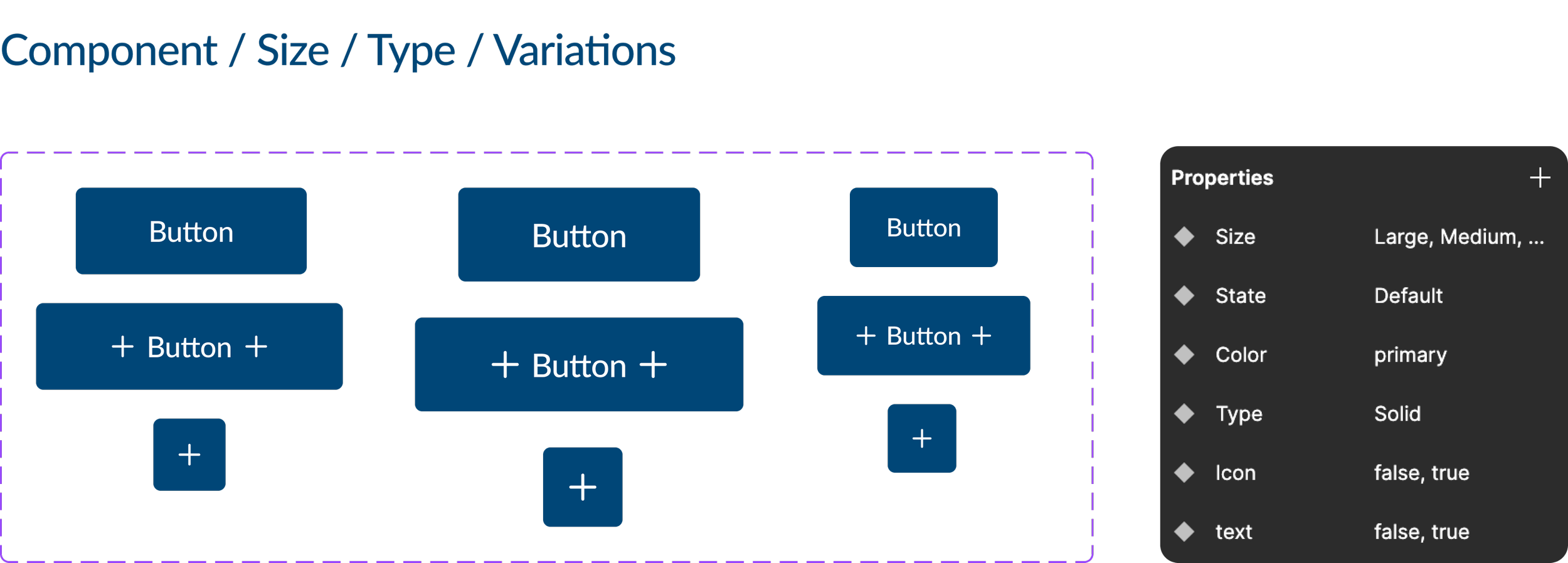
Created interactive components: I started creating the components in figma and followed a general pattern - set constraints, referred to the goals and used autolayout to build and scale the components.
At Config 2023, Figma introduced variables for design tokens, a game-changer for automating design updates across themes and devices. I integrated these variables into our design system, which significantly optimized our workflow and consistency across platforms.
Naming Conventions
Setting naming conventions: I streamlined naming conventions and component organization to enhance clarity and usability for both designers and developers.
By implementing a hierarchical naming system with forward slashes, I ensured intuitive navigation and consistent labeling. Given our platforms’ exclusive use of light mode, precise categorization helped prevent redundant versions, optimizing component management and integration.
What are the next steps?
Grow and maintain the Design System while raising UX awareness within the organisation
Our design system is continuously evolving, driven by iterative changes and ongoing learning. Currently, we have a robust collection of foundational components in place. This has significantly enhanced our team's efficiency while ensuring consistency and uniformity across projects.
Introduce microanimations
With the foundation in place, I will start exploring the build of more complex components and interactions such as microanimations to enhance user experience.
Retrospective
So what did I learn throughout the 6 months..
Building the design system at Home Trust Company was a valuable experience for sharpening both my investigative and technical skills. Unlike other systems I’ve developed, this role involved navigating the unique challenges of integrating a design system into a rapidly evolving environment.
It required a deep understanding of how the system would support designers, developers and stakeholders through different stages of project development, allowing me to address the specific needs of efficiency-driven projects.

